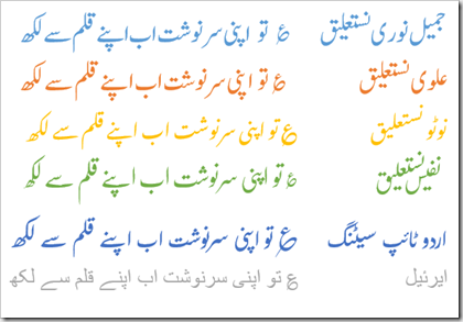
tl;dr - A survey I carried out shows that 55% of the respondents considered Jameel Noori Nastaleeq to be the most readable out of six commonly used Urdu fonts on the web.
Update: These stats were updated on Aug 4, 2015
The data below is from a small survey I carried out in order to learn about font preferences of Urdu readers on the Internet. Here’s how it was conducted.
- 5 prevalent Urdu Nastaleeq fonts were selected.
- Arial (Unicode) was added as the 6th font.
- Top 500 ligatures (by frequency) from a corpus of 19.3 million words were selected and concatenated to form a paragraph of text.
- For normalization, the text was formatted to fit in a box covering approximately half of an A4 page (about 12 lines, single spaced) and font point size was adjusted accordingly.
- 6 such boxes were created, one for each font.
- Each box was assigned a letter.
- An online survey was created in a ‘blind’ setting and the voting link was shared over social networks.
- Votes were collected over a period of 8 months.
Results: Out of the 281 responses recorded, 55% preferred Jameel Noori Nastaleeq while 24% thought Alvi Nastaleeq was more readable.
| Font | Responses |
| Jameel Noori Nastaleeq | 156 |
| Alvi Nastaleeq | 67 |
| Arial | 10 |
| Noto Nastaleeq | 30 |
| Urdu Typesetting | 15 |
| Nafees Nastaleeq | 3 |
| Grand Total | 281 |
Possible Errors:
I couldn’t find any published research on readability of Urdu fonts on the web. This survey can be taken as a starting point but please use the results of this survey only as a crude quantifiable measure of font preferences. (In other words, don’t cite this survey in your research, the experiment settings have oversights).
- No formal definition of ‘readability’ was provided. No example of readable or unreadable text was given.
- The participants may not be ‘experts’ in Urdu. There may be some non-native respondents in the survey.
- There may exist a bias towards Jameel Noori Nastaleeq due to the mere-exposure effect. This font is used in most Urdu based print publications, including daily newspapers and magazines.
- While the height was same for all fonts, each used a different point size (11-15).
- It was noticed later that due to an error in conversion, the image for Nafees Nastaleeq was slightly smaller than the rest of the fonts, which might have caused some votes to change in favour of other fonts.
- Some respondents have commented that comparison between fonts would have been better/easier if the text was in the form of readable phrases or sentences (rather than ligatures). There were reasons of not doing that. Firstly, I was lazy and didn’t want to find a set of phrases which covers all high frequency ligatures in a minimum number of sentences. Secondly, IMHO, form should be distinct from meaning and how things look should not be effected by what they mean. I can be convinced otherwise with respect to the latter reason but for the former one, I will not budge :)
Comments/suggestions/criticism welcome.

